Thursday, 27 November 2014

Group: Mock Photos


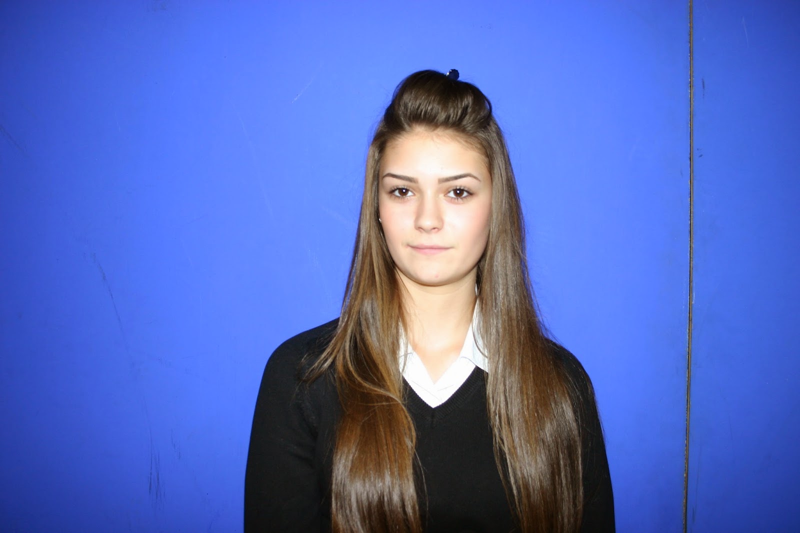
We tried out very feminine gestures such as pouting to emphasise that women have a position in the music industry. It was also for a bubbly, friendly, 'pop' portrayal of the artist.


Generally We have aimed to position Charlie in the centre of frame looking directly at the camera but also took more candid shots of her laughing and caught off guard to create a more spontaneous and authentic viewpoint on our artist.


For our real shoot we will have Charlie dressed in the same outfit she wears in our video to create an obvious link. She will also wear the fox mask for the back cover image to link to the artist.


Some gestures we had observed by 'Foxes' herself such as the one above on the left. In review we really don't think this is the type of image we want as our front cover because it does not look natural.


We experimented with and without flash to get an idea of the exposure and colours that could be created. We prefer the images with flash because they have a clean, professional, studio look.


References to the illuminati are a common feature of musicians of the 21st century so we have experiments with this as well. It gives the look of the images a quirky, edgy appeal that is very current.

Goup: Review of Thursday 27/11/14

In this double lesson we collaboratively looked through our footage finding areas that needed improvement such as faster cutting rates and editing techniques like colour grading and overlays. We took screenshots for potential inside panes and made a blog post of our findings. We then went on to take our mock photos of Charlie in front of the blue screen in the positions we had planned. We tried out several expressions and hand gestures then made a post of this.

Todays lesson has successfully prepared us for moving on to the editing of the (hopefully) final draft of our product as well as the development of our mock digipak and advert then quickly onto the real product. The next stage will be to practise editing our mock photos and screenshots then to plan a day and location to take the real photos.

Group: Potential Inside Panes


These are a range of potential screen shots we have taken from our music video. We decided to use these for our inside panes on our digipak because the quality of our footage is so good, so it will look professional and effective.


We were extremely enthusiastic about how effect the stills from the time lapse sequence looks. There is a ghosting effect, a great way of creating movement in a still image. As Charlie was still her figure is clearest, so she stands out more keeping the focus of the album on her as 'Foxes'.


The silhouettes created by the shadow from the projector light is very seductive and visually intriguing because it has a powerful connotation of the artist. We think it would make a great background pane for the CD placement.

Wednesday, 26 November 2014

Group: Reflection of Wednesday 26/11/14

Amelia: Continued editing, tidying up the timeline and correcting any errors. I then uploaded this draft to Youtube. The next step will be continuing to speed up and slow down the cutting rhythm where appropriate and experimenting with visual techniques such as colour.


Emma-Louise: Further looked into the conventions of magazine adverts
.
Charlie: Researched design details for our digipak eg. font. I looked at websites such as Dafont and 1001 free fonts to look for possible fonts we could use on our album, which are similar to the font used on 'Foxes' album covers (for example Glorious).

Tuesday, 25 November 2014

Group: Reflection of Tuesday 25/11/14


Today the group allocated specific roles for each other to focus on.
  • Charlie - My role was to be the blog director, checking that posts have visuals on them if appropriate and that all posts are titled correctly with the right amount of detail.

One of the blog posts I amended was the 30 second clip we showed to the class of our edited music video so far. This post didn't have any feedback we received from the class and so I added the positive feedback as well as the improvements that were suggested we make in order to make the production look better.

  • Emma-Louise - I edited our music video on premiere, adding a faster cutting rate by dropping more shots onto the timeline and shortening the clips and further tidying it up.

  • Amelia - Print production designs for our digipak and magazine ad. I made initial sketches of our main panes and created descriptions and a detailed outline for each.


Monday, 24 November 2014

Group: Digipak Font Ideas


Dafont: http://www.dafont.com/new.php?page=3

  • Blank Space
  • Bebas Kai
  • Mode G
  • Facile Sans
  • CF Historia
  • Franchise
1001 Freefronts: http://www.1001freefonts.com/new-fonts-30.php

  • Keep Calm Medium
  • News Flash
  • Hurshey's
  • MTF Base


Thursday, 20 November 2014

Group: Magazine Advertisment Plan


A4 Page


  • To maintain the theme of our music video conforming to the pop genre, we want our magazine advert to highlight this through showing a conventional pop artist style. Therefore, using the example of Rihanna's magazine advert, we want to recreate something like this as it is typical of mainstream pop female artists to sell their track and star image.
  • Although, we want to create a half page advert for our track, as Foxes is a mainstream pop artist and so wouldn't need to sell her image as much as new coming artists, having already established her star persona to a varied audience.
  • Rihanna is positioned within the rule of thirds, to the right hand side of the page, this focuses more attention on her as an audiences eyes are initially drawn to the corners of a frame. This is a technique we want to use when designing our magazine advert.


  • We want to include the concept of rule breaking when designing our magazine advert, with the manipulation of 'white space'. With this, we want to covey an aspect of uneasiness to a small extent, with the animals in the video formulating curiosity.
  • Having a colourless background will stop the image from looking overly busy and prevent it from being cluttered, which will focus more attention on the female actor and draw the audiences eye to her.

  • Within our magazine advert, we want the female actor to wear the fox animal mask which is featured in the video. This will connect the ad with the video and identify the female actor as singing to one of 'Foxes' (the artists) song tracks.


Group: 30 Second Extract


Feedback from the class

Positives
  • The overlay of two images showing different angles of the fire projection looks very effective, it gives the video an added layer of texture which makes it appear aesthetically pleasing.
  • The cut between the animal masks helps to identify the audience with wildlife animals and links them well with the field location.
  • The misty background works well with the mood of the track, providing it with a dismal feel.
Improvements
  • We need to make the cutting rate faster in order to make it conform to a pop music video and fit better with the pace of the track.
  • We could cut to projection shots in some of the field locations so that we have short pieces of footage showing to keep the audience entertained.

Group: Review of Wednesday 19/11/14


In Wednesday's lesson, the group mainly took priority in editing the footage we have filmed in Premiere and have now got quite a lot edited in the correct order. We also discussed digipak designs and magazine ad ideas we would use to promote our music video, finalising concepts from our previous group blog post regarding print products.

Tuesday, 11 November 2014

Group: Print Production Plan


1. What ideas do you have about your print products?

  • 4 pane digipak design

Front cover:
  •  MCU of actor in the middle of the frame.
  • Shot in front of a green screen so that we can add a coloured background when editing in Photoshop.
  • Colours we are thinking to add on our digipak are cold hues such as pink, purple, blue and grey.
  • The font wont be too fancy, we want it to be bold (in capitals) and preferably white in colour.
  • We could also go back to our field location and take a photo of the female actor in front of the misty background, to suit the images within our music video.


Back Cover:
  • LS of actor in one third of the frame, possibly with an animal mask on (a fox) to represent the artists track we have used.
  • We could use an image from the street location, positioning the actor against a black fence. As these images would contain natural lighting, we would saturate the image to give it a drained look to fit our theme.
  • The other singles that are on the album will be in a small font, in white also, to maintain a font colour scheme in order to make our design look professional.


Inside Panes
  • Conceptual shots of animal masks we use in our music video (preferably the fox and owl mask as they relate to lyrics in the song).
  • Place the masks on a white surface so that all the attention is focused on them.
  • Place the masks within the rule of thirds possibly.

2. How will the print products link with the video to give a cohesive brand?
  • Our digipak design will be based upon locations that are shown within our music video.
  • The main female actor who is represented as dominant compared to the male actors will be symbolised in the same way on the digipak.

3. Which magazines would your adverts go in? why?
  • Pop magazines such as Billboard
  • Fashion magazines such as Bazaar, Grazia, Cosmopolitan, Instyle, Glamour, Company
  • Our adverts would feature in these types of magazines as we incorporate a young female actor that is presented some what as glamorous with a short, velvet dress.
  • The genre of our track also fits within the pop genre, therefore our album would be mentioned in pop magazines.


Group: Review of Tuesday 11/11/14

Charlie: Blog post on our progress with our digipak ideas, researching Foxes already existing album artwork to take inspiration from.

Amelia and Emma-Louise: Researched suitable magazines to showcase our advert for our chosen track in and editing footage.

Monday, 10 November 2014

Group: Review of Monday 10/11/14

This lesson we have all taken part in over-viewing our newest footage and starting to edit areas into the timeline. We have decided to adopt a rough editing technique where we drop footage into the timeline in places where the lip syncing fits. As our editing progresses we plan to cut the clips shorter and alternate between locations so there is a faster cutting rate more like what is in the majority of music videos.

Tuesday, 4 November 2014

ER: Deconstruction of a Digipak

Rihanna - Unapologetic

GENRE
How is the genre of the track/artist evident?
Rihanna follows a variety of genres, pop and R&B being her most prominent. It is clear to see this is a pop album cover because of the generic features included: the female artist being the centrepiece with a plain and basic background behind her. This is because the typical aim of the pop genre is to use the artist's image to sell their music. The fact that she isn't wearing any clothes isn't uncommon either because the vast majority of female pop artists use their sexual image to sell their music as that tempts in a larger audience of males who may not usually listen to pop music of that kind. We can tell that she is also prone to R&B by this as well as the fact that she has a tattoo, suggesting street culture.


MEDIA LANGUAGE

What visual techniques are used? (rule of thirds, texture, colour, tone, mise-en-scene).
The framing of the shot is placing Rihanna directly in the centre to bring her to the main focus. The plain, empty, white background emphasises this. The only colours visible is the warm tones of her skin in contrast to her black hair, portraying her to be beautiful but cold. We can also tell this from the mise-en-scene used, the focused, defiant facial expression and the seductive pose she holds through her body language. The slightly low camera angle shows reinforces her position of being strong because she appears to be looking down on the audience.

How is meaning generated through these techniques? (semiotics)
The fact that she is the centrepiece represents a feminist attitude that she can stand strong and independent as a woman and the low angle shot reinforces this. The warm tones portray her passion while the scrawled writing over her body implies her many emotions that she may be trying to show through the music on this album, both features usually linked with femininity. The seductive position she stands in reinforces a dominant belief that women sell themselves through sex appeal.

What linguistic devices have been used? (look at emotive language, use of quotations, connotations of song/album title)
Unusually, more writing than just the title is used on this album cover. Her naked body is covered with very scrawled words like "side effects", "faith" and "victory", that don't make any sense together, but suggest individual deep meanings. The messy style of the writing, as if it was handwritten suggests a lot of emotions and suggests an view into the artist's mind. This makes her audiences strive to know the deeper meaning to these and do this by continued consumption of her work. The word "love" is scrawled over her face so that although she is breaking the fourth wall by looking straight into the camera, it's indirect because it blocks most of her face. It also implies that this is the most important word written on the front.

Is there any intertextuality/references to popular culture? How does this create meaning for the audience? Think about postmodernism here, use of parody, pastiche.
One of the words on the album cover is "#Navy". This is a reference to the popular social network Twitter by the use of the hash tag, meaning a trending topic. Twitter is where she connects with her fans which she called "the Navy" as a way of forming a stronger connection with them so that they feel like they know her. This portrays her as very present but also absent as they almost feel like they are her friend but they are not quite within  touching distance of her, this follows Dyer's theory of the "star image" where artists portray themselves as simultaneously present and absent so that their audience strive to complete their image by consistent consumption of their work.

REPRESENTATION
How are the band/artist represented? Does this add to their 'meta-narrative' in any way? How does it help sell their product?
Rihanna is primarily represented as a sexual object through the lack of clothes she is wearing, further emphasising her meta-narrative of being wild and out of control by being a sex symbol. But she is also represented as being strong by her defiant facial expression and the way she stands alone, independent. This sells her product because her desirability is seen as something to aspire to, placing her as a role model.


INSTITUTION AND AUDIENCE
How might this print text be consumed? How is this evident in the way it is constructed?
This print text would be consumed in a place where people are likely to buy the album for example a CD shop, iTunes or adverts promoting the album. The artwork is there to give an accurate representation of the style of music in the album.

BACK COVER
 
 
The back cover for Unapologetic has a very edgy design in black and white, contrasting with the front cover's simple but colourful design. The writing for the track names is in the same scrawled font as on the front cover for continuity. A photo of Rihanna is also used but here she is clothed and looking away from the camera, setting a different scene and environment. It also includes the barcode and key names of who has been involved in the production of this album including Def Jam.


Monday, 3 November 2014

CB: Deconstruction of a Digipak

B'Day (Beyoncé, 2007)


GENRE
How is the genre of the track/artist evident?
-A dominant reading path of females being used as an object of sexual desire is implemented within Beyoncé's B'Day album front cover, an element often manipulated by pop artists. The size of her image is relevantly larger in comparison to the rest of the cover, which elevates her status as a women immediately and suggests that she is to be taken seriously within the pop industry. This challenges dominant ideologies of women being perceived as powerless by media platforms, with her bold stance suggesting empowerment and leadership. Using Goodwin's (Dancing in the Distraction Factory, 1992) theory of genre characteristics, we can identify Beyoncé as a performer with the promiscuous stance she displays on the back cover of her album. With one leg raised and her hip sticking out, she is purposely positioned for the male gaze showing bare arms, legs and upper chest. It is a conventional feature of the pop genre to represent women in such a suggestive way as it attracts a larger audience of males, which helps to sell not only the album, but the artist themselves.

MEDIA LANGUAGE
What visual techniques are used? (rule of thirds, texture, colour, tone, mise-en-scene).
-Beyoncé is positioned within the rule of thirds to the right hand side of the frame in both the front and back covers of the album. This is because our eyes tend to wonder towards the corners of a frame and so we find it more aesthetically pleasing to look at. Also, as Beyoncé is positioned within the rule of thirds we find her image more comforting to look at, with nothing threatening to be seen in the background which places her within a safe environment. Therefore, an adult audience is more enticed to let their children listen to her music as a sense of security and trust is formulated.

-The satin gold dress and knee high boots Beyoncé is seen wearing on the album connotes a need for her to be seen as a sexual fantasy. Using Dyers critical framework of the 'Star Image', Beyoncé is being represented as a "sexual magnet" revealing her perfectly bronzed feminine assets. She further has a semi-mythological set of meanings constructed around her star image, with qualities such as youthfulness and rebellion being highlighted through the addition of a cigarette holder. The implication of smoking detracts from the concept of 'safety' suggested on the front cover, as this is a hazardous act parents won't want their children to follow causing her to lose face to an audience.

-Beyoncé wears natural make up on the album cover that shows her as being ordinary, with the addition of her hair being worn up in a messy style conforming to this idea also. She has a pair of plain hoop earrings in her ears which are easily accessible for an audience to receive and so help her to be seen as an idolised figure of both fashion and music.

How is meaning generated through these techniques? (semiotics)
-As a preferred reading of her assertive stance, it is signified that Beyoncé is conforming to social myths such as feminism by representing female independence. Only she is featured on her album which connotes possession and pride in what she has achieved, representing strong feminine values of success.

-With Beyoncé wearing a short, low cut outfit on this album, it goes on to act as her USP on other album covers she has. The indexical sign created by her image provides her with a status of having good taste, being fashionable and trendy with the arguable occasion of her appearing too raunchy. For example, in her Crazy in Love video featured on the 'Dangerously in Love' album.


What linguistic devices have been used? (look at emotive language, use of quotations, connotations of song/album title)
-The interpretation gathered from her album being called 'B'Day' can be deconstructed as having a cultural significance of symbolising youth. B'Day is a shortened expression used to signify someone's birthday and so could be manipulated in Beyoncé album to target youth by using a language they can relate to. This provides her with a respected status amongst youths as she is possibly making them feel important by suggesting how even celebrities use informal language.

Is there any intertextuality/references to popular culture? How does this create meaning for the audience? Think about postmodernism here, use of parody, pastiche.
-The pale blue and pastel green colours present on the front cover of the album compliment each other in providing a realistic look. They help to represent a desirable country lifestyle that welcomes the consumer into being a part of the narrative world being conveyed, in this example, of an idyllic rural habitat which creates a relaxed mood. This acts as a selling point in encouraging an audience to want to listen to the songs on the album, as they are being illustrated to have a calming tone. The lighting on both the front and back covers support a realistic feel as they are fairly natural, which help to establish a positive rapport between her and the audience. Adopting Dyers theory of paradoxes, the lighting represents her as being an ordinary person just like her audience, which makes her music more relatable to real life situations.

-As Beyoncé is seen on the back cover of her album with a cigarette holder, it could have a pastiche reference to 60's fashion icon Audrey Hepburn who is better known for her famous black and white pose with a cigarette holder.


REPRESENTATION
How are the band/artist represented? Does this add to their 'meta-narrative' in any way? How does it help sell their product?
-Beyoncé is represented as a strong and passionate woman through the use of CU's emphasising her devoted facial expression. However, her facial expression can also be depicted as seductive which builds upon the idea of her being seen as a sexual figure, luring men in especially to buy her product. This adds towards her meta-narrative of being seen as desirable, but further implies her aspiration to want to be successful.

INSTITUTION AND AUDIENCE
How might this print text be consumed? How is this evident in the way it is constructed?
-This print may be consumed in popular CD shops such as HMV, with the mainstream pop style suggesting it to be worthy of being presented in such respected digital shops.
-The B'Day album was released by Columbia Records, an American flagship recording label under the ownership of Sony Music Entertainment. As SME is a big conglomerate operating within the music industry, they are likely to have the power to vertically integrate the album to other media subsidiary's in order to distribute Beyoncé's product onto multi media platforms.
-This gives the album the opportunity to be a wide spread phenomenon, being available on websites such as YouTube, Vevo and Spotify.
-Due to the album appearing on such websites, it means that it was able to be targeted by youths as they are the main audience for using web 2.0. This would increase the repeatability of the album with it be so easily accessible to people via the internet.

Group: Shoot 1-29/10/14

On Wednesday we did our first shoot in the Field location in Cudham. Overall it was successful as we produced all the specific shots we wanted too plus some fillers and various reshoots of specific shots. The shots accomplished include the speed ramp, time laps, lip sync and close ups of the animal masks.
Difficulties that occurred were that we found the weather conditions like rain, wind and freezing temperatures meant we had a temperamental cast and so this had to be taken into account with the time spent shooting and re-shooting. Also because we were covering the camera to protect it from the rain it was hard to keep watching the focus of the shot so some pieces of footage were out of focus. This meant the footage we edit will have to be checked for its quality and we can experiment with using the unfocused images or sharpening them.

Nevertheless the location, time of day and weather all worked in our favour as there were no people getting in the way in the early morning and the translucent white mist worked beautifully in making the scene look atmospheric as a backdrop for the artist and surrounding characters. The dull cold colour fit our colour scheme and is a great basis for colour grading.