Evaluation
Final music video
Final print work
Secondary research - music video analysis
Secondary research - deconstructing a digipak
Audience research: post video
Audience research: rough cut
Audience research: concept development
Animatic
Pitch
Contribution to the pitch
Concept development: print work
Technical analysis
Brighton reccie video
Brighton reccie evaluation
Monday, 12 January 2015


8531 - Emma-Louise Richardson - Navigation Post
Evaluation
Final music video
Final print work
Audience research post video
Audience research rough cut
Audience research concept development
Animatic
Pitch
Print analysis
Technical analysis
Semiotic analysis
Brighton reccie
Genre and representation analysis
Institution and audience analysis
Narrative and media language analysis
Moodboard
Lonely Boy preliminary task - planning, production and evaluation
Secondary research: music video theory, music video analysis', initial response to our track, institutional context
Final music video
Final print work
Audience research post video
Audience research rough cut
Audience research concept development
Animatic
Pitch
Print analysis
Technical analysis
Semiotic analysis
Brighton reccie
Genre and representation analysis
Institution and audience analysis
Narrative and media language analysis
Moodboard
Lonely Boy preliminary task - planning, production and evaluation
Secondary research: music video theory, music video analysis', initial response to our track, institutional context
Thursday, 8 January 2015
Tuesday, 6 January 2015
Group: Focus Group Questions
Music Video
- What do you think the video is about? What is the story?
- Who do you most identify with? Explain what it is about them you identify with?
- What mood is created?
- What do you think the masked men represent?
- What particular shots stand out?
Print Media
- What kind of music genre would you expect from this digipak?
- In what ways does our digipak remind you of the video?
- What emotions do you associate with these magazine adverts?
- What do you think these magazine adverts say about the artist?
Thursday, 18 December 2014
Group: Audience Feedback
POSITIVES
NEGATIVES
- The focus on one person was really effective and enticing to follow, good for an unfocused viewing.
- Works well with the mood of the music.
- Creative camera angles and techniques.
- The lip synching was done really well matching it to the track in editing.
- The introduction of the characters with animal masks was done really well, it was professional and intriguing.
- Amazing editing with an interesting narrative that works really well with the song.
- Projections on the wall are very well executed and suit the genre.
- Close ups do well to construct star image.
- Animal masks added more connotations to the video.
- Projector shots added a lot to the mood of the song.
- The location of the field worked really well with the mist/fog in the background.
- The masks are really effective and I like how they link to the lyrics.
- "Young hearts" with Danny and Sandy projected behind creates a good portrayal.
- The overlays of fire are really great.
- The performance was realistic looking and extremely convincing.
- Speed ramp creates build up.
- Good cutting on the beat in the field.
- Good intertextual references in the background on projector.
- Love the use of the reverse at the end.
- Decisions made for what to project and locations were very successful.
- Timeline shots look very effective.
NEGATIVES
- The projections sometimes made it hard to see the protagonist-We see this as a positive as it conforms to Dyers paradox that an artist appears both present and absent.
- The dancers degraded to seriousness intended from the narrative.
Monday, 8 December 2014
AR: Contribution to Production
I have taken the primary role in shooting and editing our video. So I led with the positioning and movement of the camera after having the rest of the groups approval and agreement. For editing I took control of the mouse while we collaboratively decided where shots should be positioned. I refined the cutting rate to fit the music and experimented with the time stretch for particular shots to synchronise with our track's rhythm and for practicality to make shots fit neatly.

I have taken a prevalent role for our advert and digipak, overviewing the development and processes taken on photoshop. I put the digipak together with all the panes we edited. I individually collected screenshots straight from Premiere using the Freaze Frame tool and edited the resolution and used reflections to extend areas of the image to fit into the panes. I edited the images for both of the adverts and then sent them to Emma-Louise for further refinements such as adding in the text and links.

I have taken a prevalent role for our advert and digipak, overviewing the development and processes taken on photoshop. I put the digipak together with all the panes we edited. I individually collected screenshots straight from Premiere using the Freaze Frame tool and edited the resolution and used reflections to extend areas of the image to fit into the panes. I edited the images for both of the adverts and then sent them to Emma-Louise for further refinements such as adding in the text and links.
CB: Contribution to Production
As part of the production process, I have taken a lead role mainly within the construction of our print product. For example, I have researched and deconstructed magazine page layouts, as well as looked at possible fonts which would be suitable for our digipak design on websites such as Dafont. In creating our digipak mock up in Photoshop, I made one possible version of a back cover focusing on positioning the actor in the rule of thirds.

We took mock photos of various stances and positions the actor could display that looked generic of the female solo artist we are impersonating 'Foxes'. This helped us throughout our photo shoot and allowed the process to run smoothly. When importing the image into Photoshop, I opened up the selected image I wanted to experiment with and used the 'magic wand tool' located in the selection bar (to the left) to cut out the blue screen background. This then allowed me to choose a suitable colour for the background which we could then go onto use on our actual digipak product.
However, I took a secondary role during the editing process of our music video, suggesting possible ideas we could use to make it better whilst someone else took the primary lead role in making the changes.
ER: Contribution to Production
I took a primary role in the digipak and magazine advert production, while taking a secondary role in editing. This meant that I overlooked and suggested ideas for the editing process while also taking part in the use of premiere.
Thursday, 4 December 2014
Group: Review of Thursday 4/12/14
Amelia: I completed the video and exported it and I edited the image for the magazine advert and sent it to Emma-Louise for adding font and finalising. I went on to take higher quality screenshots straight from premier for the two panes in the digipak.
Emma-Louise: I downloaded the font and added it to the advertisement then saved it as a PNG file. I then went on to make a post of this.
Charlie: I planned our schedule for shooting the final album cover tomorrow and helped Emma-Louise.
Emma-Louise: I downloaded the font and added it to the advertisement then saved it as a PNG file. I then went on to make a post of this.
Charlie: I planned our schedule for shooting the final album cover tomorrow and helped Emma-Louise.
Group: Final Magazine Adverts
We have decided to do a half page advert to follow our chosen genre of pop. Pop artists usually have an unfocused reading because they are most likely to be used in adverts etc. This means that she won't need as big an advert as an upcoming artist who would need to sell themselves, her name is already established in the music industry.


Wednesday, 3 December 2014
Group: Digipak Mock Up Ideas
This week, we have been experimenting with different album cover designs that we could possibly use for our actual digipak product.
Mock Up 1: Charlie

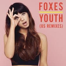
This is one example the group have come up with, to have a LS of the female actor in frame and positioned within the rule of thirds. I placed a light purple background on the design as the artists style we are trying to recreate only using light colours. The stance and hand signal the actor is displaying symbolises the artist 'Foxes', in imitating one of her iconic poses she uses on an existing single cover.
Mock Up 2: Emma-Louise


Thursday, 27 November 2014
Group: Mock Photos


We tried out very feminine gestures such as pouting to emphasise that women have a position in the music industry. It was also for a bubbly, friendly, 'pop' portrayal of the artist.


Generally We have aimed to position Charlie in the centre of frame looking directly at the camera but also took more candid shots of her laughing and caught off guard to create a more spontaneous and authentic viewpoint on our artist.


For our real shoot we will have Charlie dressed in the same outfit she wears in our video to create an obvious link. She will also wear the fox mask for the back cover image to link to the artist.


Some gestures we had observed by 'Foxes' herself such as the one above on the left. In review we really don't think this is the type of image we want as our front cover because it does not look natural.

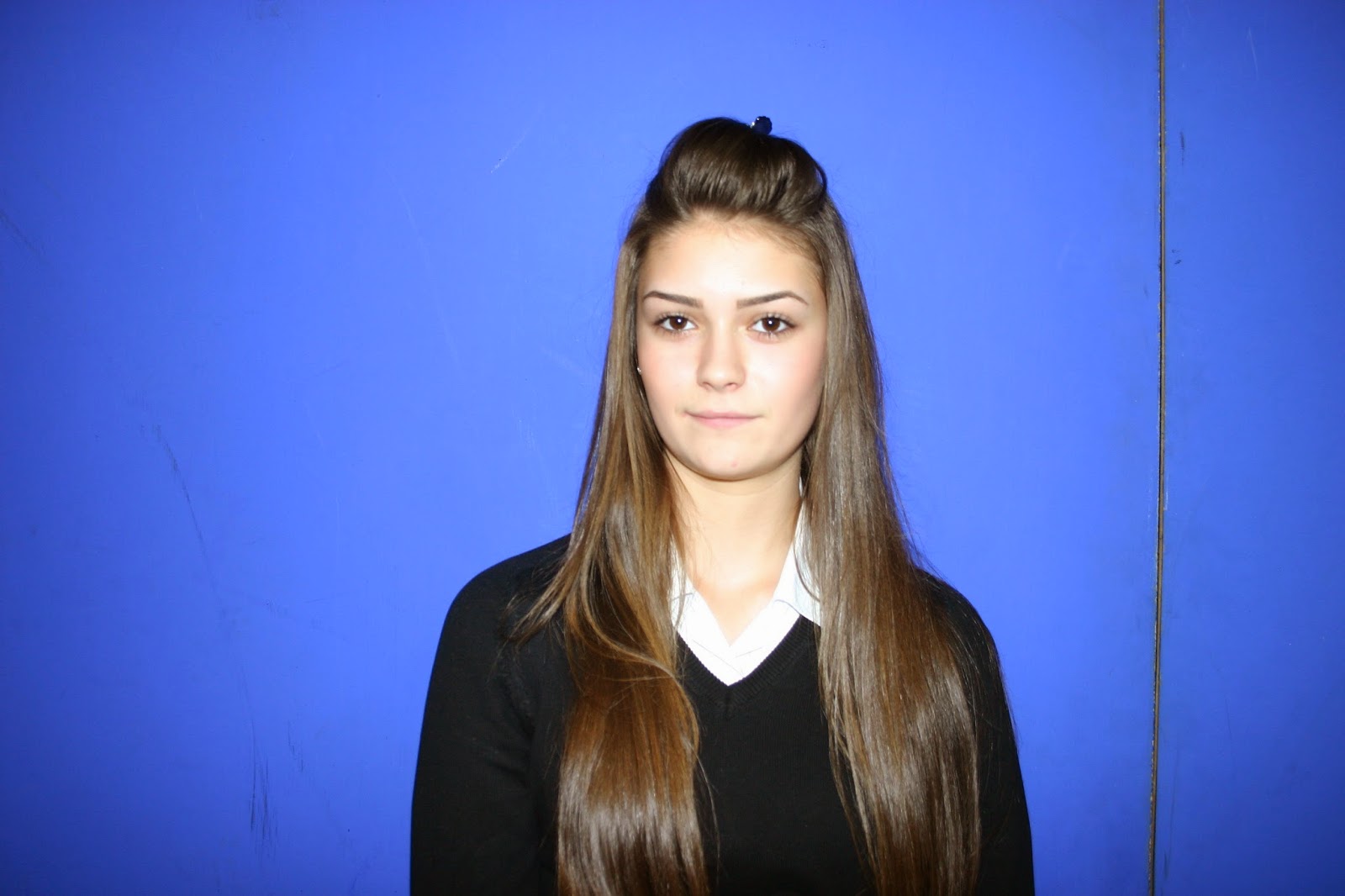
We experimented with and without flash to get an idea of the exposure and colours that could be created. We prefer the images with flash because they have a clean, professional, studio look.


References to the illuminati are a common feature of musicians of the 21st century so we have experiments with this as well. It gives the look of the images a quirky, edgy appeal that is very current.


Goup: Review of Thursday 27/11/14
In this double lesson we collaboratively looked through our footage finding areas that needed improvement such as faster cutting rates and editing techniques like colour grading and overlays. We took screenshots for potential inside panes and made a blog post of our findings. We then went on to take our mock photos of Charlie in front of the blue screen in the positions we had planned. We tried out several expressions and hand gestures then made a post of this.
Todays lesson has successfully prepared us for moving on to the editing of the (hopefully) final draft of our product as well as the development of our mock digipak and advert then quickly onto the real product. The next stage will be to practise editing our mock photos and screenshots then to plan a day and location to take the real photos.
Todays lesson has successfully prepared us for moving on to the editing of the (hopefully) final draft of our product as well as the development of our mock digipak and advert then quickly onto the real product. The next stage will be to practise editing our mock photos and screenshots then to plan a day and location to take the real photos.
Group: Potential Inside Panes


These are a range of potential screen shots we have taken from our music video. We decided to use these for our inside panes on our digipak because the quality of our footage is so good, so it will look professional and effective.


We were extremely enthusiastic about how effect the stills from the time lapse sequence looks. There is a ghosting effect, a great way of creating movement in a still image. As Charlie was still her figure is clearest, so she stands out more keeping the focus of the album on her as 'Foxes'.


The silhouettes created by the shadow from the projector light is very seductive and visually intriguing because it has a powerful connotation of the artist. We think it would make a great background pane for the CD placement.
Subscribe to:
Posts (Atom)